Toyota's Logo: How it evolved

History plays a vital role in where we stand today as a human race. Most of us do not like to learn or read about it because it is boring. But it is history that has helped us evolve as human beings and develop/invent new ideas and things that we use today.
 Everything has a history of its own. Big automobile brands started small and evolved over the years. And so have their logos. A brand logo is very crucial because it is not just a sign to help you recognize the company, it is much more than that. It represents an entire firm, its goals, objectives, history; all that in just a symbol. A brand logo has some or the other hidden meaning. Today, we are going to decipher Toyota's logo - how it was first made, how it changed over the decades of the existence of the company, and what does it mean.
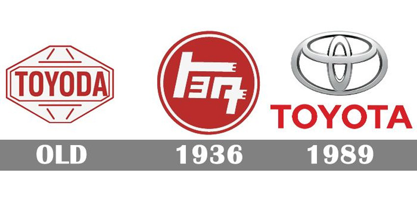
Toyota was not always known as ‘Toyota’. When it was founded in 1935, it was named after its founder ‘Toyoda’. The brand’s first logo did not involve a whole lot of research or study but was a result of a design contest organised by the company. The logo simply said ‘Toyoda’.
 During this time there was another logo on which ‘Toyoda’ was penned down in Kanji. Apart from the word, the logo also had either wing, which symbolizes speed, or the shachihoko, an iconic symbol associated with Nagoya, the city where the company was founded.
This logo was being used in all the cars Toyota was producing at that time. However, during the 1940s the company was renamed from ‘Toyoda’ to ‘Toyota’. According to Toyota, there were three reasons for this action. First, ‘Toyota’ sounds better. Second, ‘Toyota’ needs eight strokes to be written in Japanese, which is considered to be a good fortune. Third, it marked the transition of the company into one of the largest automobile manufacturers in the world.
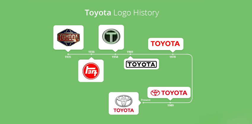
That is how ‘Toyoda’ become ‘Toyota’. With the name, the brand logo had to be changed, too. The new logo was quite simple. It was round in shape with ‘Toyota’ written in Kanji. It is said that this was an important logo for the company as it transitioned from ‘Toyoda’ to ‘Toyota’. So, the logo had to be something which would allow the customers to relate to the previous name, and to let them know that it is only the name that has changed, and nothing else. During this time another logo came into existence - the script of Toyota. It was red in color. It is still being used by the company in its car lineup and promotional materials.
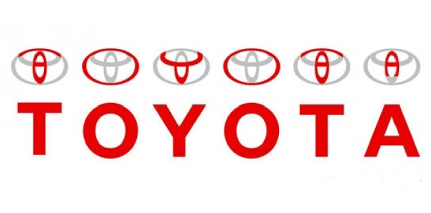
So how was Toyota’s present logo born? It was introduced in 1989 to commemorate company’s 50th anniversary. It was a new beginning for Toyota. This logo has three ovals. Two of them are located inside the third big oval. One of the two inner ovals represents the heart of the customers, whereas the other one is the heart of the company. These two ovals form a T which represents Toyota while also resembling a steering wheel. The large outer oval represents the world embracing Toyota.
The first car in which Toyota used this logo was their flagship model at the time, the Celsior. Since then Toyota implemented this logo gradually throughout its product line. And it is being used even today throughout the world.

Toyota Car Models
-

Toyota Veloz -
Toyota Yaris -
Toyota Vios -
Toyota Corolla Cross -
Toyota Hilux -
Toyota Rush -
Toyota Fortuner -
Toyota Innova Zenix -
Toyota Harrier -
Toyota Innova


Malaysia Autoshow


Trending & Fresh Updates
- Latest
- Popular
-

-
-
-
-
-
-
-
-
-
Electric Car: A comprehensive buying guidePurva Jain, Jul 01, 2024
-
Must watch automotive movies for enthusiastsPurva Jain, Feb 21, 2024
-
Car Rust-proofing 101: All you need to knowPurva Jain, Feb 15, 2024


You might also be interested in
- News
- Featured Stories


Toyota Featured Cars
- Latest
- Upcoming
- Popular
-
 Toyota Urban Cruiser EVRM 198,000 OTR Price Kuala LumpurEMI : RM 2,313 x 84Write a Review VIEW APRIL OFFERS
 -
Toyota Hilux BEVRM 226,300 OTR Price Kuala LumpurEMI : RM 2,644 x 84Write a Review VIEW APRIL OFFERS
-
-
Toyota GR CorollaRM 367,000 - 378,950 OTR Price Kuala LumpurEMI : RM 4,289 x 844.48 (21 Reviews) VIEW APRIL OFFERS
-
Toyota Vellfire HEVRM 549,900 OTR Price Kuala LumpurEMI : RM 6,426 x 845 (1 Reviews) VIEW APRIL OFFERS
-
Toyota Vios HEV GR SportRM 109,900 Expected Price Kuala LumpurEMI : RM 1,284 x 84Write a Review VIEW APRIL OFFERS


-
-
Toyota Yaris CrossRM 99,900 - 109,900 Expected Price Kuala LumpurExpected Launch TBA Alert Me When Launched
-
-
Toyota Alphard HEVRM 570,000 Expected Price Kuala LumpurExpected Launch TBA Alert Me When Launched


-
Toyota VelozRM 95,000 OTR Price Kuala LumpurEMI : RM 1,110 x 844.44 (34 Reviews) VIEW APRIL OFFERS
-
Toyota YarisRM 70,490 OTR Price Kuala LumpurEMI : RM 1,028 x 844.28 (63 Reviews) VIEW APRIL OFFERS
-
Toyota ViosRM 89,600 - 95,500 OTR Price Kuala LumpurEMI : RM 1,047 x 844.17 (71 Reviews) VIEW APRIL OFFERS
-
Toyota Corolla CrossRM 130,900 - 146,000 OTR Price Kuala LumpurEMI : RM 1,529 x 844.26 (47 Reviews) VIEW APRIL OFFERS
-
Toyota HiluxRM 103,880 - 169,080 OTR Price Kuala LumpurEMI : RM 1,213 x 844.29 (69 Reviews) VIEW APRIL OFFERS
-
Toyota RushRM 93,000 - 97,000 OTR Price Kuala LumpurEMI : RM 1,086 x 844.27 (61 Reviews) VIEW APRIL OFFERS
Latest Toyota Car Videos on Zigwheels
-
2024 Toyota Innova Zenix Hybrid | Part 306 May, 2024 .
-
2024 Toyota Innova Zenix Hybrid | Part 206 May, 2024 .
-
2024 Toyota Innova Zenix Hybrid | Part 106 May, 2024 .
-
Diesel vs Hybrid: Toyota Fortuner vs Corolla Cross Comparo | Zigwheels.Ph13 Sep, 2021 .
-
2021 Toyota Fortuner G 4x2 Review | Zigwheels.Ph13 Sep, 2021 .
-
2021 Toyota Corolla Cross | ZCinema13 Sep, 2021 .
-
GR Yaris or GR Supra? | Zigwheels.Ph13 Sep, 2021 .
-
2021 Toyota Vios GR-S | ZCinema13 Sep, 2021 .
-
2021 Toyota Corolla Cross Hybrid Review09 Aug, 2021 .
-
Trackday with the GR Yaris09 Aug, 2021 .